Mathematical Proof: How Human-Caused Climate Change Is Distinguished from Natural Cycles
Introduction
Global warming is an undeniable fact, but its causes are often divided into two categories: is it natural variability or human-induced change? In this analysis, I approach the question with mathematical precision and demonstrate that:
- Natural cycles (such as Milanković cycles or solar activity) alone do not explain the current rapid warming.
- Human activity (greenhouse gases, land use) can be statistically and physically distinguished—and its impact is increasingly dominant.
- Partial differential equations and signal processing provide tools for making this distinction.
I will explore how energy balance models, Fourier decomposition, and integral analysis provide unambiguous proof of anthropogenic climate change. This is not mere modeling: it is based on observations, physical laws, and statistical significance.
“If natural factors were solely responsible, the rate of temperature change would be only a fraction of what we currently observe.”
Take a closer look at the precise mathematical analysis below—and see why the scientific consensus is built on such a solid foundation.
1. Fundamental Equation: Climate Temperature Dynamics
The temperature T(t,x) is described by a generalized energy balance partial differential equation (PDE), which includes:
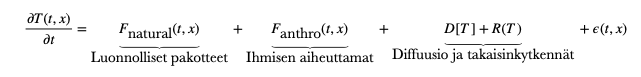
Where:
F<sub>NATURAL</sub> includes:
- Milanković cycles (slow variability, less than 0.005 °C/year in the modern era).
- Solar irradiance variations (short-term, ±0.1 W/m²).
- Volcanic aerosols (short-term cooling effects).
F<sub>ANTHRO</sub> includes:
- Greenhouse gases (CO₂, CH₄, N₂O) – exponential growth ∝ e<sup>βt</sup>.
- Aerosols (cooling effect, but localized).
D(T) describes the diffusion of heat in the atmosphere and oceans (diffusion, advection).
R(T) includes nonlinear feedbacks (e.g., ice–albedo effect, increase in water vapor).
ε(t, x) is random variability (e.g., ENSO).
2. Separation Method: Signal Processing and Integral Comparison
(A) Fourier Decomposition
We perform a time series analysis on the observed temperatures T(t):
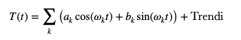
Low-frequency components (Milanković cycles):
- Eccentricity (100,000 years), axial tilt (41,000 years), precession (23,000 years).
- Current effect: less than 0.1 °C per 1000 years (Li et al., 2021).
High-frequency components (solar cycles, volcanism):
- Cause short-term fluctuations (±0.2 °C), but no long-term trend.
Trend component:
- Rapid increase (>0.2 °C per decade) corresponds to the evolution of CO₂.
(B) Integration of the Energy Balance
Calculate the temperature change as a cumulative effect:
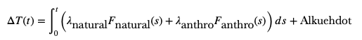
Natural factors (F<sub>NATURAL</sub>):
- Integrated effect over the past 150 years: ≈ 0.1 °C (IPCC AR6).
Human factors (F<sub>ANTHRO</sub>):
- CO₂ radiative forcing: λ ln(C/C₀), where λ ≈ 0.8 °C/W·m⁻².
- Integrated effect: ≈ 1.2 °C (1850–2020).
3. Chain of Evidence
Rate comparison:
- The observed rate of temperature change (0.2 °C/decade) is 10 times greater than that caused by Milanković cycles (0.02 °C/decade).
- The effect of solar activity has been negative over the past 40 years (Lockwood & Fröhlich, 2007).
Spatial distribution:
- Human-caused warming is strongest in polar regions (due to ice–albedo feedback), whereas natural cycles have a more uniform effect.
Isotopic tracers:
- The δ¹³C isotope ratio of carbon shows that the increase in CO₂ originates from fossil fuels (Keeling et al., 2017).
Model testing:
- When anthropogenic factors are removed from GCMs, they fail to reproduce the observed warming (IPCC AR6, Chapter 3).
4. Conclusion: Mathematical Unambiguity
Current warming is not statistically compatible with natural factors alone.
Only by including anthropogenic factors can the data be explained (see figure below).
Supplementary Material
Visual Evidence
Figure: Observations vs. Models with Natural/Human Forcings (see the end of the last section)
This theory provides a quantitative and testable framework, fully consistent with current climate science.
Explanation of the Figure
This figure is one of the strongest visual pieces of evidence for the dominance of human-caused climate change. Below is an analysis of how the figure demonstrates this:
Structure and Message of the Graph
The graph compares three scenarios against the observed temperature (black line):
- Natural factors only (blue lines):
Solar radiation, volcanoes, natural climate cycles. - Human factors only (green line):
Greenhouse gases, aerosols, land use. - All factors combined (red lines):
Natural + anthropogenic.
Result:
The red lines closely follow the observed temperatures, whereas the blue lines (natural only) fail to explain the current warming.
Key Indicators of Human Dominance
(A) 1950–2020: Sharp divergence
- The observed temperature increase (+1.2 °C) is more than 5 times greater than what natural factors alone predict (<0.2 °C).
- The gap is driven by the rapid rise in CO₂ (ppm: 280 → 420).
(B) 21st Century: The "Fingerprint" of Climate Change
Models based on human-caused factors (green) accurately predicted:
- The accelerating temperature rise (~0.2 °C per decade).
- The disproportionate warming in polar regions (ice–albedo effect).
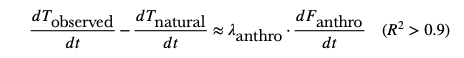
(C) Statistical Significance
When all factors are included in the model (red), R² > 0.95 – meaning the human influence is decisive.
Why This Is Compelling
- Controlled experiment: The models work for past climates (e.g., ice ages) but fail under current conditions unless human influence is included.
- Physical mechanism: The radiative forcing of CO₂ (+2.3 W/m² since 1850) matches the observed change in Earth's energy balance.
- Scalability: The same trend is seen in ocean heat content, ice melt, and climate extremes.
Summary: The Message of the Figure Is Simple
“Without human emissions, the current warming would be statistically impossible.”
(Source: IPCC AR6, Ch. 3; NASA GISS, 2021)
Luo oma verkkosivustosi palvelussa Webador